
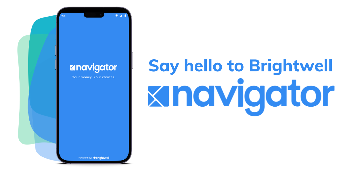
Brightwell Navigator has a NEW Blue Look!


Our roots at Brightwell began in the banking industry of Chicago 20 years ago, evolved into prepaid cards for the cruise industry, and now we’ve grown into a larger fintech company with multiple financial products that help move money around the world.
Brightwell Navigator is our mobile app, website, and prepaid card program that allows global workers to send-and-spend money around the world. Just we as company continues to grow and evolve, so has our audience that uses Brightwell Navigator. To help differentiate Brightwell navigator from its other family of products, we redesigned the Brightwell mark from a green circle to a blue square.
As you can see within the evolution of our logo we've tried to keep the design all within the same cohesive visual identity. Over the next few months you'll see other visuals and design changes to many of our marketing materials (digital and print) as we move in this new blue direction.
Author John Maxwell states that “change is inevitable, but growth is optional.” At Brightwell, change is embraced because growth is not optional. The modifications being implemented across our brand not only demonstrates the growth of our company from its Chicago roots but also better position Brightwell for growth in the future as an innovative Atlanta fintech.


.jpg)

